My Active Health Wellness Platform
Company
CVS Health
Problem & Context
My Active Health (MAH) is a large-scale digital wellness platform used by diverse member populations to assess health risks, complete wellness activities, earn rewards, and engage in personalized care pathways across mobile and web.
Over time, the experience became fragmented as features were added incrementally across teams. Key journeys, including registration, onboarding, pathways, and task completion, lacked a cohesive structure and shared system foundation.
Primary challenges included:
Inconsistent navigation patterns and unclear information hierarchy across mobile and web
A Pathway experience with limited labeling, guidance, and progress visibility, leaving members unsure of next steps
A Health Checklist that created cognitive overload and obscured task value and status
An overly long registration and onboarding flow that increased friction and abandonment risk
Accessibility gaps, including insufficient color contrast, improper heading hierarchy, poor focus management, layouts that did not support zoom users and inconsistent component usage
Significant design system debt, with redundant components, legacy patterns, and inconsistent tokens slowing delivery and increasing rework
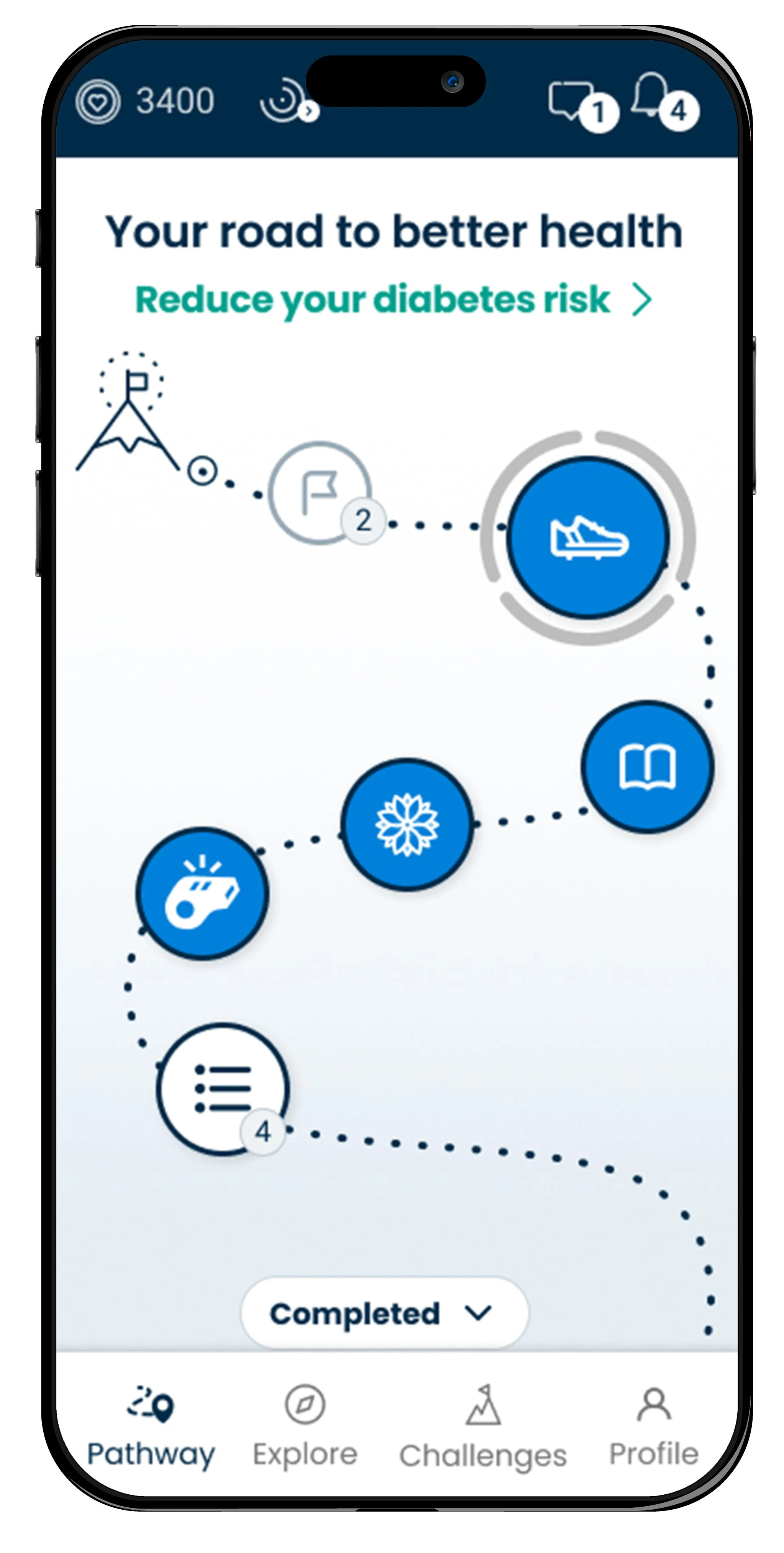
Previous mobile app landing page before redesign lacks labeling, guidance, progress and fails accessibility.
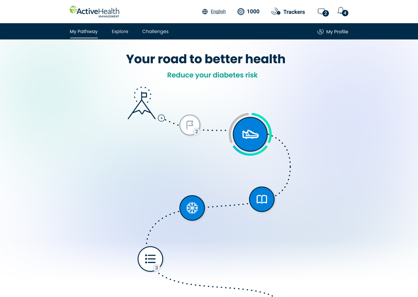
Previous desktop web landing page before redesign lacks labeling, guidance, progress and fails accessibility.
My Role
As a Senior UX Design Manager, I led end-to-end experience improvements across registration and onboarding, the Health Checklist, Pathways, and the MAH design system.
I was responsible for:
Defining the experience vision and system strategy
Leading journey-based redesigns grounded in user research
Modernizing the design system to reduce debt and improve scalability
Partnering closely with product, engineering, and business stakeholders
Facilitating workshops and establishing governance to support consistent execution
Approach & Solution
I approached the work holistically, addressing both user-facing journeys and the system foundations beneath them to ensure the experience functioned as a cohesive ecosystem rather than disconnected features.
Key solutions included:
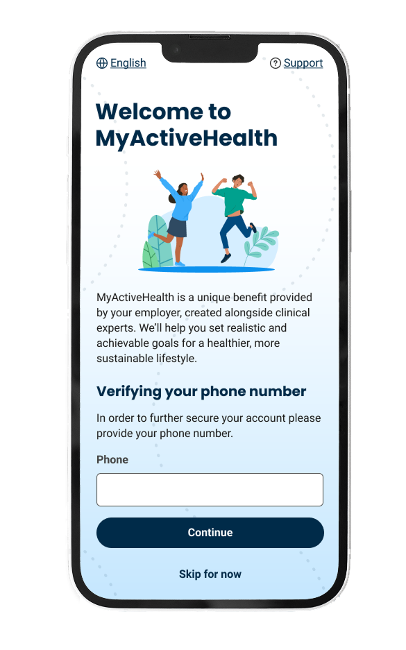
Streamlining registration and onboarding, reducing the flow from 25 screens to 10 to lower cognitive load and accelerate development and QA
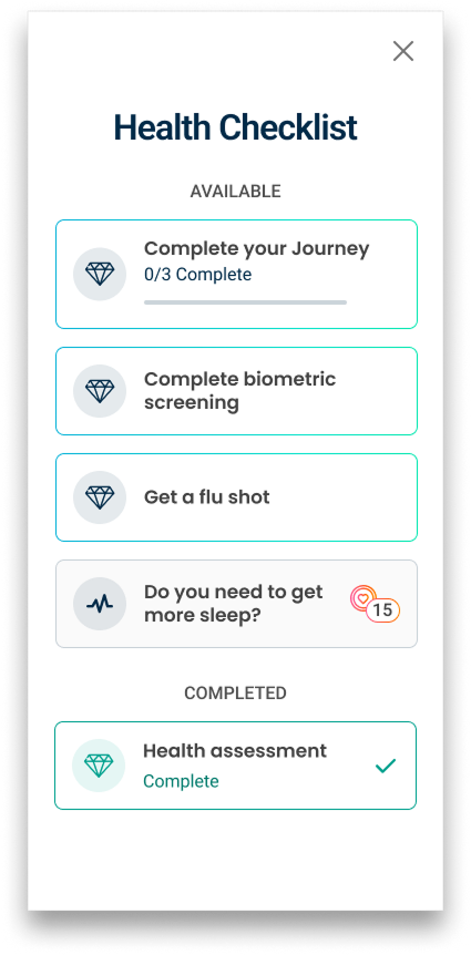
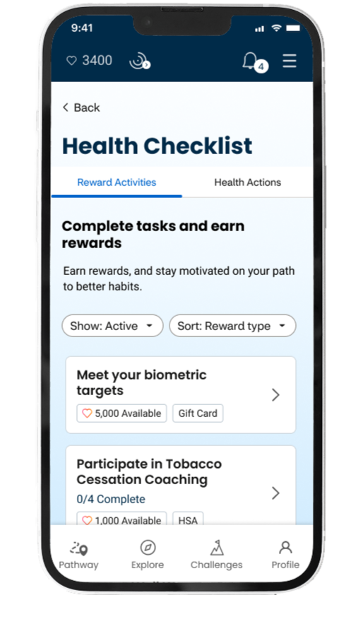
Redesigning the Health Checklist to improve task clarity, prioritization, and motivation through clear Available, Pending, and Completed states
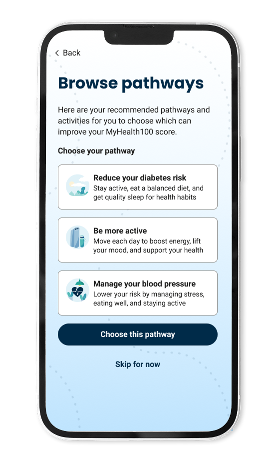
Reworking the Pathway experience with clearer hierarchy, labels, progress indicators, and status cues so users understand what to do next
Resolving 100+ accessibility defects by:
Removing problematic sticky buttons that interfered with content and focus order
Fixing color contrast issues to meet accessibility standards
Correcting heading hierarchy for proper screen reader navigation
Designing layouts that support zoom users without loss of content or functionality
Establishing consistent focus states and interaction feedback across components
Introducing a unified token system with accessible color ramps, semantic variables, and system/action/background tokens
Consolidating 150+ Card variants into 2 scalable components, dramatically reducing complexity while improving reuse
Establishing platform-specific component libraries and documenting usage for core components, iconography, and system messaging
Leading research activities, including usability testing, card sorting, stakeholder interviews, and competitive analysis, to ground decisions in real user behavior
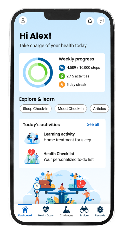
The mobile app landing page I redesigned to include clear personalized and guided content, progress and labeling, a balance of visual content with improved illustration that meets WCAG accessibility standards.
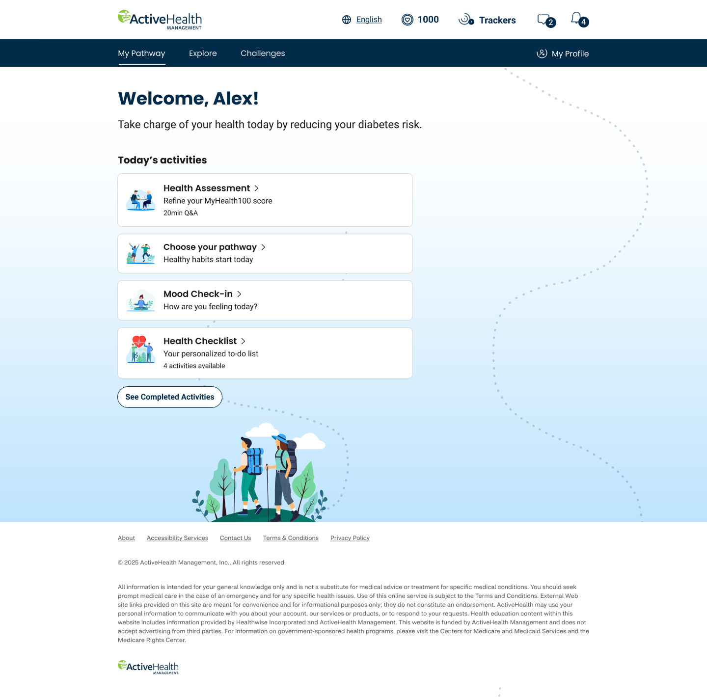
The desktop web landing page I redesigned to include clear personalized and guided content, progress and labeling, a balance of visual content with improved illustration that meets WCAG accessibility standards.
Legacy Health Checklist Experience: Disruptive full-page modal, lacking context on rewards, limited discoverability, and accessibility issues
Redesigned Health Checklist: Full-page layout with clear labels, tabs to limit focus on set activities, sort and filter chips, and improved loading performance
Demonstrating Impact
This work delivered measurable improvements across usability, accessibility, and delivery efficiency:
Eliminated 100+ accessibility defects, significantly improving compliance and inclusive usability
Reduced cognitive load and friction across critical journeys
Improved clarity and predictability through consistent interaction patterns and hierarchy
Accelerated design and engineering workflows through cleaner libraries, tokens, and documentation
Reduced rework and defects by eliminating legacy patterns and redundant components
Increased cross-team confidence through clearer governance and shared system standards
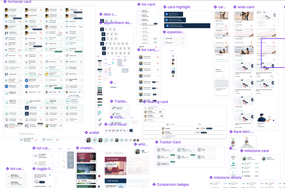
Pre-System Card Component in Figma: 150+ ungoverned variants with visual inconsistency, accessibility issues, and high maintenance risk
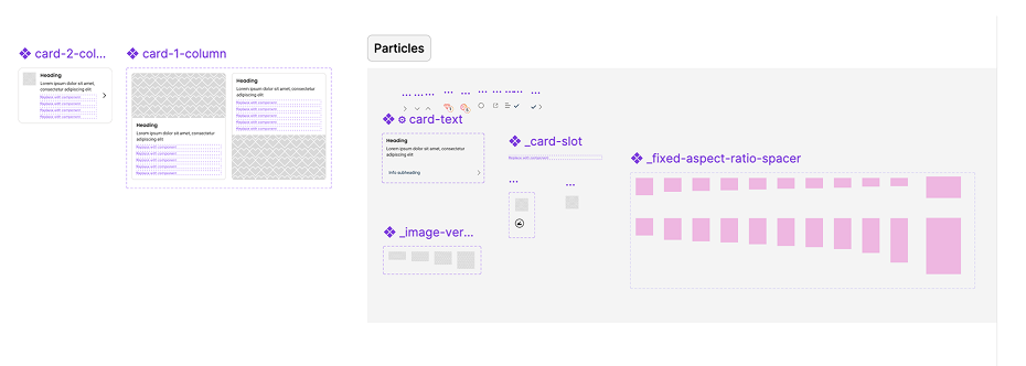
Scalable Card Component: Reduced to 2 core variants with tokenized parts for consistency, accessibility, and easy maintenance
Outcomes
Registration and onboarding reduced by 60% (25 → 10 screens)
100+ accessibility issues resolved, including contrast, focus states, layout for zoom users, and heading structure
150+ Card variants consolidated into 2 scalable, system-ready components
A modernized design system with accessible tokens, updated color ramps, and consistent component usage
A clearer, more motivating Health Checklist that communicates task value, status, and progress
A Pathway experience that provides users with clear guidance and visible progress
Faster handoffs and improved collaboration across UX, product, and engineering teams
Key Learnings
Accessibility must be built into foundations, not layered on after features are complete
Reducing complexity improves both usability and velocity for users and teams
System consistency enables inclusive design at scale
Governance accelerates delivery by reducing ambiguity and rework
Strong UX leadership blends craft, systems thinking, and alignment
Redesigned core My Active Health journeys: registration, onboarding, and the pathway dashboard.

