Policy Dashboard & Coverages Experience
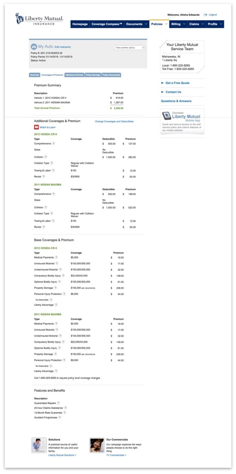
Before - Liberty Mutual Policy experience.
Company
Liberty Mutual Insurance
Problem & Context
The policy dashboard is a critical touchpoint within Liberty Mutual’s eService platform, where customers review coverage details, understand premium impacts, and make policy changes. Users typically arrive with a specific task in mind, such as reviewing coverage, adding a vehicle, or understanding how a change might affect their premium.
However, the experience presented multiple competing entry points and inconsistent terminology, forcing users to scan dense pages or navigate an overloaded mega menu to accomplish simple tasks. Redundant navigation paths, low-value links, and unclear labeling increased cognitive load, while low-contrast text and inaccessible controls made critical information harder to process. Coverage details were presented in long, table-heavy layouts that were difficult to scan or understand, especially in a high-anxiety domain like insurance.
Instead of guiding users through confident self-service, the experience required them to decode the interface, leading to confusion, drop-off, and increased reliance on customer support.
My Role
I led UX design for the policy dashboard and coverages experience, partnering closely with Product, Engineering, and Research. My scope included problem framing, research synthesis, information architecture, interaction and visual design, and validation. I was responsible for aligning user needs with business goals while navigating technical and organizational constraints.

Impact map to help define problem statement

Synthesizing observation notes from moderated user testing in order to prioritize feedback
Approach & Key Decisions
Rather than attempting a broad redesign of eService, we focused on high-impact improvements within the policy experience that could deliver measurable results.
Key decisions included:
Prioritizing clarity and confidence over completeness by reducing information density
Simplifying navigation and entry points to align with user mental models
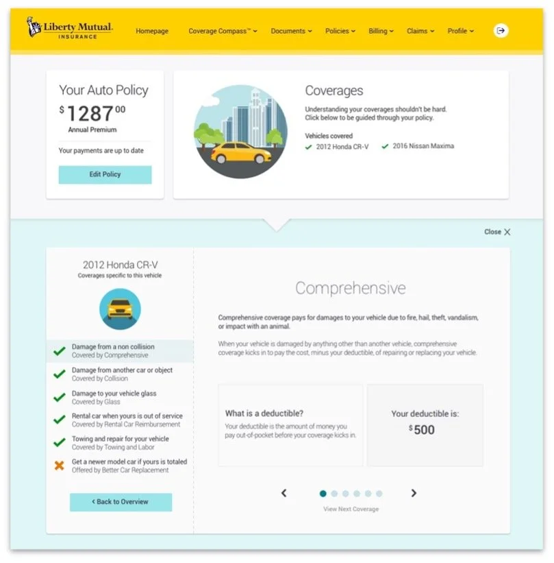
Replacing dense tables and hidden tooltips with scannable layouts and progressive disclosure
Using plain language and visual hierarchy to reduce anxiety around complex insurance concepts
Success criteria were defined upfront using an impact map, translating user confidence and understanding into measurable outcomes such as policy views, quote starts, call deflection, and NPS.

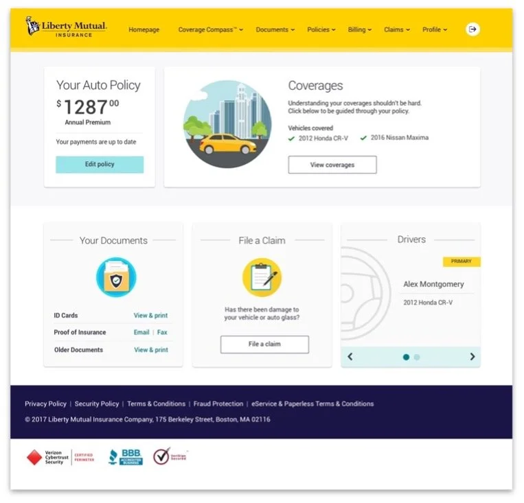
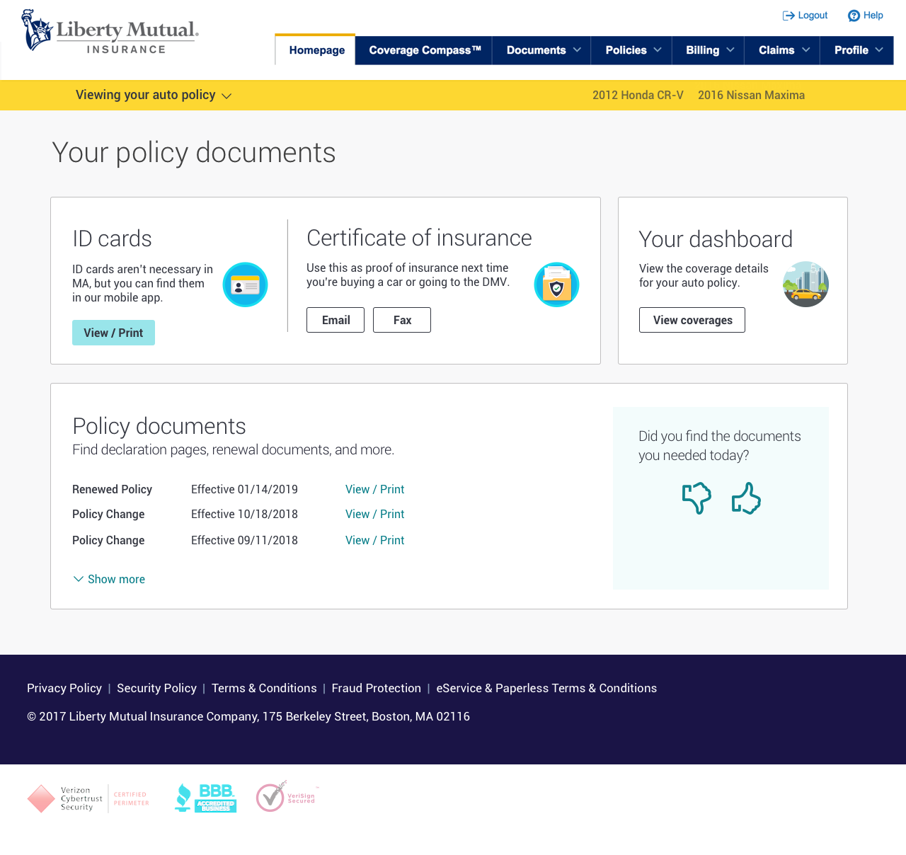
Final dashboard design as part of the user experience for ‘I Manage My Policy’. I created this design in Sketch, prototype in Invision, along with the illustrations & icons that I created in Illustrator.
Solution
The redesigned experience introduced a dashboard-based policy overview that surfaced the most relevant information first and guided users toward meaningful actions.
Coverage information was restructured to:
Improve scanability through consistent hierarchy, spacing, and typography
Clarify what is covered versus not covered using more intuitive language and layout
Reduce visual noise by removing low-value content and marketing distractions
Support accessibility through stronger contrast and larger, more readable text
While larger navigation changes, such as reworking the mega menu, were constrained by shared ownership across teams, the solution established a scalable foundation aligned with emerging brand and style guide efforts.

Outcomes & Impact
Following A/B testing and rollout to 100% of users, the redesigned experience delivered measurable improvements across both engagement and confidence metrics:
27% increase in policy views and 14% increase in quote starts, indicating clearer paths to action
22% increase in call deflection, reducing reliance on customer support
18% increase in Net Promoter Score and reported user confidence, reflecting a simpler, more trustworthy experience
These results validated the approach and demonstrated that reducing cognitive load and improving clarity could directly influence business outcomes.
Key Learnings
This project reinforced the importance of designing for confidence in high-anxiety domains like insurance. By focusing on mental models, progressive disclosure, and accessibility, even constrained improvements can significantly impact user behavior and satisfaction. It also highlighted the value of aligning success metrics early to ensure design decisions are grounded in both user and business outcomes.